- DataViz: Energy Consumption and Production
- Source Code
- Video
- Documentation
- Home
Overview
This project provides exploratory visualization to analyze energy production and consumption data from around the world. The dataset used is compiled by the US Energy Information Administration. This dataset includes data on the energy produced and consumed by most world countries between 1980 and 2012. The amount of energy is also broken down by different energy types (petroleum, renewables, natural gas, coal, electricity). The goal of this project is to look at how the above variables have been changing over time, and to try to look for relationships between energy consumption rates and carbon emissions for different countries and/or world regions.
Visualizaion Video
Design Process

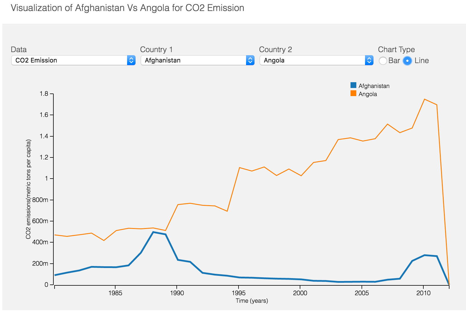
The process of design visualization began on my notebook. At the beginning, I started sketching various ways I can show the trend of various energy type for a specific country. For this trend analysis, line and bar chart are the obvious choices.
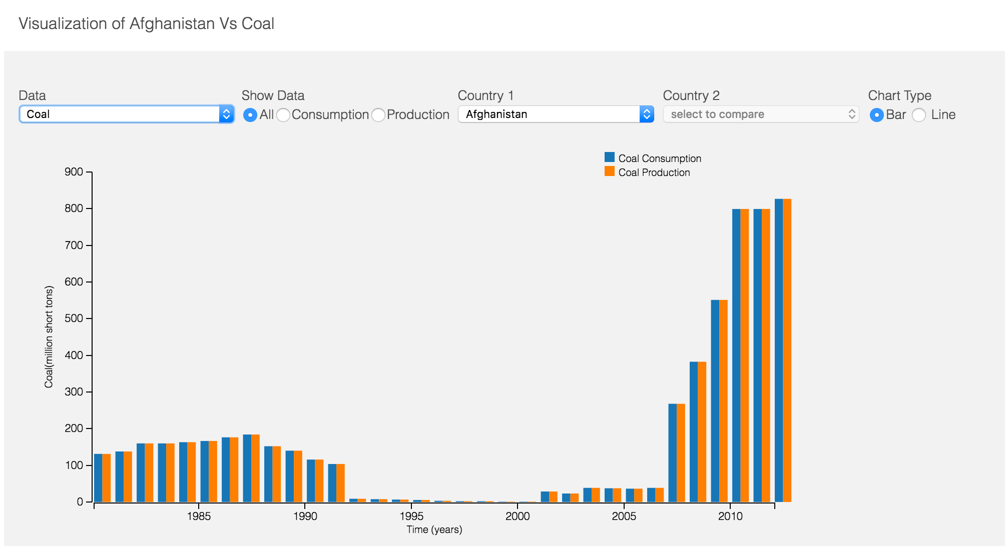
The second stage of visualization was to compare the composition of energy type i.e. for a particular energy how much is production vs consumption. Initial design choice was vertical split bar chart but as I progressed I found splitting bar chart would be better.
The third stage was to compare energy or data trend of two countries. The existing layout of worked perfectly with the minor adjustment to control specific energy type.
The fourth stage of data visualization was to inspire more exploratory analysis. I sketched many alternatives like linked scatter plot and word map. The above image shows few of them. Finally, I succeeded in creating scatter / bubble chart but I would have loved to do world map to plot data.
Design Choice
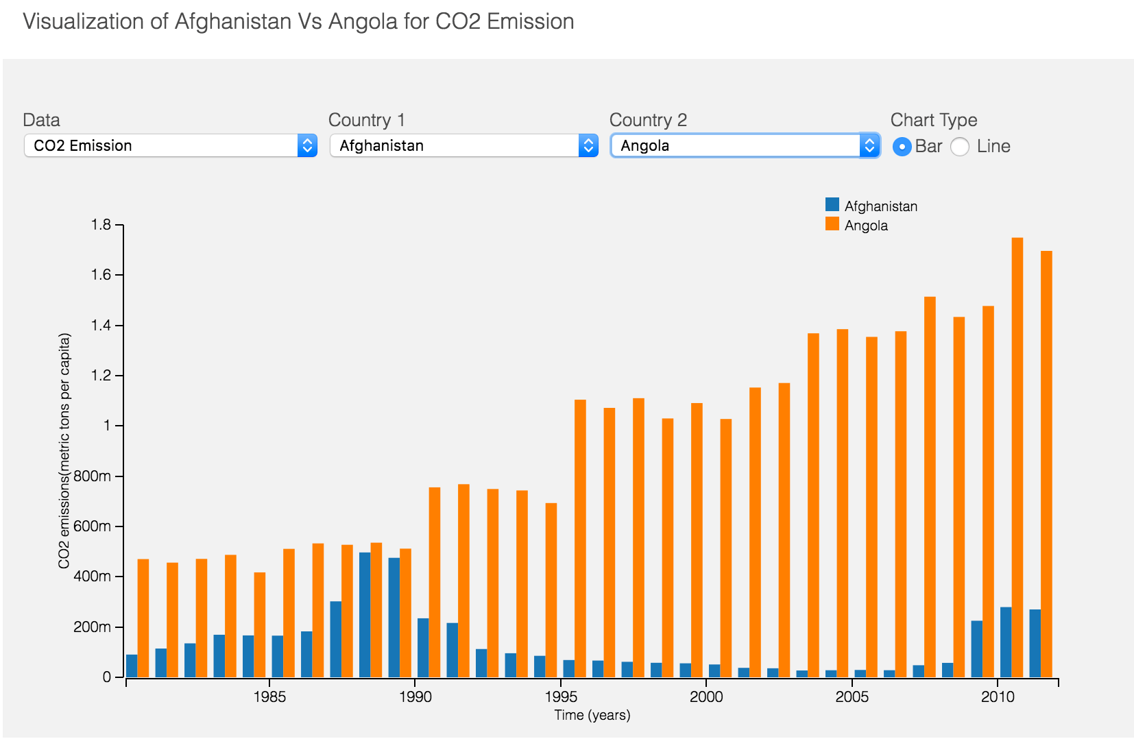
I have decided to use bar and line chart for trend analysis. I think bar chart and line chart provide better picture compare to any other graph when we want to see the trend over a range of values. Also, while, comparing the composition of the energy of one country and energy values for two different countries split or grouped bar chart provide the better understanding.
The line chart choice was provided to compare overall trend as it takes your attention away from individual value and let you focus more on trend or behavior of energy. In contrast to line chart bar chart emphasize on the individual values in a trend but same time you can view the trend as well. The trend visualization in bar chart may affect understanding when the sampling on the horizontal axis is more.
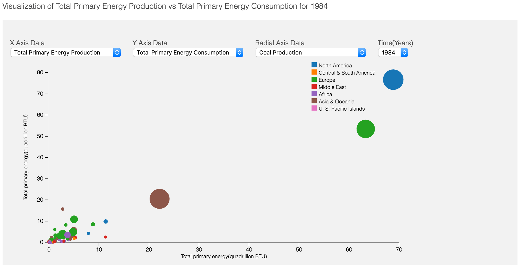
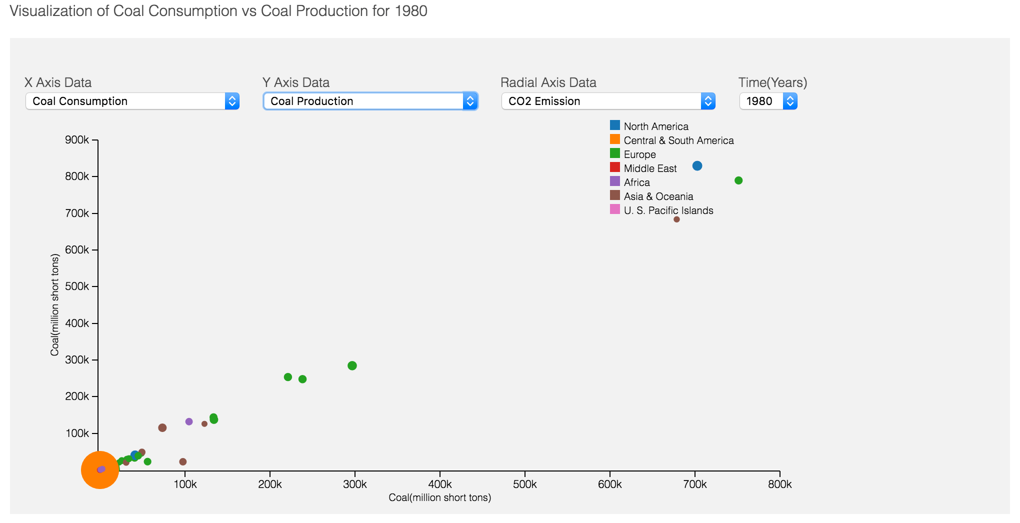
The second part of visualization was to stimulate exploratory analysis. The bubble chart is a perfect choice. With bubble chart, one can map the relationship between three to four varibles. The user can choose any energy type on x ,y and radial z-axis can explore the relationship between the those. Also, the result can be viewed over the various range of time period. This visualization can be improved to animate over time to see how these parameters change in certain duration.
When comparing energy composition and energy values for two countries, I felt important to provide the legend and scale to differentiate values better.
Discovered Facts
This visualization can be used to do various kinds of analysis. I am listing two of these findings below
#1. The first graph shows coal production of Afghanistan is with the significant drop from 1993 till 2000. It is the same period where Afghanistan is ruled by non-state actors like Taliban or other terrorist organization with little to no opportunities to produce coal. It important note that coal production increase after 2001 as Afghanistan was ruled by a civilian government.
#2. The second graph shows the relationship between primary energy production and consumption to co2 emission. Its is evident that europian and north American countries have high coal production and consumption but less co2 emission. Similarly, we can notice that Asian, African and Central American countries having less coal production and consumption with more co2 emission. Its suggest that apart from Europe and north American rest of countries depend on coal for most of their energy and they are not using coal energy efficiently causing higher co2 emission. In contrast, Europe and north America being more efficient and eco-friendly despite higher volumes of coal usage.